Good visual novel UI design disappears into the background, letting the writing and art carry the experience without the interface calling attention to itself. Bad UI design does the opposite, distracting from the story through cramped text placement, illegible fonts, or overdesigned textboxes that fight for attention against the character art they’re supposed to be supporting. Interface design rarely gets discussed as much as writing or art quality in the visual novel format, but it shapes how comfortable and immersive hours of reading actually feel in ways that are easy to underrate until a genuinely bad interface makes itself impossible to ignore.
Why Interface Design Matters More Than It Gets Credit For
A visual novel asks readers to look at the same interface elements for potentially dozens of hours across a single playthrough, which means small friction points that would barely register in a shorter game compound significantly over a long reading session. A textbox with slightly too small text, or a choice menu with slightly too little contrast against its background, becomes genuinely tiring after several hours in a way it might not after just twenty minutes.
This cumulative effect is part of why experienced readers often notice and complain about UI issues that a first-time player might not immediately register as a problem. The fatigue builds gradually, and by the time it’s consciously noticeable, it’s already been quietly working against the reading experience for a while.
Textbox Placement: Bottom vs. Side vs. Full Screen
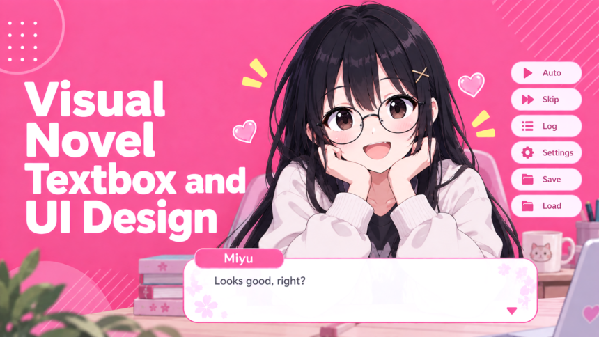
Where a textbox sits on screen affects both how much art remains visible and how naturally the eye moves between text and character expression. A textbox running along the bottom of the screen, the most common placement in ADV-style visual novels and the default mode in engines like Ren’Py, keeps the majority of character art and background fully visible above it, which works well for scenes where visual presentation matters as much as the dialogue itself.
Side-positioned textboxes, less common but still used in some titles, place text and character portraits closer together, which can reduce the amount of eye movement needed to connect a line of dialogue with the character delivering it. This placement sacrifices some horizontal art space in exchange for that tighter visual-to-text connection, and whether that trade-off is worth it depends heavily on how much a specific visual novel leans on full-screen art composition versus close character interaction.
Full-screen text, characteristic of NVL-style presentation, abandons the fixed textbox model entirely in favor of prose filling most of the available screen space. This trades constant visual presence for room to support longer, denser writing, and it works best specifically in stories or scenes where sustained narration matters more than continuous visual engagement.
Font Choice: Readability vs. Theme
A visual novel’s font carries more weight than it might initially seem, since it’s the element a reader’s eyes interact with literally every single line of the entire game. Decorative or heavily stylized fonts can reinforce a specific mood or setting, particularly in period pieces or horror titles aiming for a particular atmosphere, but that thematic reinforcement only works if the font remains genuinely readable at the sizes and contrast levels the game actually uses.
A font that looks striking in a promotional screenshot but becomes genuinely difficult to parse during actual extended reading represents a real design failure, regardless of how well it fits the game’s aesthetic on paper. The strongest approach usually treats readability as a hard floor that thematic font choices need to clear first, rather than treating visual theme and legibility as equally weighted priorities that can be freely traded off against each other.
Text size interacts with this directly. A font that’s perfectly legible at a larger size can become genuinely straining if a game’s default settings render it too small, particularly for readers on smaller screens or those playing at a distance from a TV or larger monitor. Games that allow adjustable text size give readers meaningful control over this trade-off rather than locking everyone into a single fixed choice.
Textbox Opacity and Background Visibility
How transparent or opaque a textbox appears against the background art directly affects how much of a scene’s visual composition remains visible while reading. A fully opaque textbox guarantees consistent text legibility regardless of what’s happening in the background art, but it also permanently obscures whatever portion of the screen it covers, which matters more in visual novels investing heavily in detailed background art and composition.
Adjustable opacity settings give readers direct control over this trade-off, letting anyone who wants to prioritize seeing background art clearly reduce textbox opacity, while readers who find lower opacity settings harder to read against busy backgrounds can keep it fully solid. Not every visual novel offers this level of control, and its absence in a specific title isn’t necessarily a dealbreaker, but its presence represents a meaningful accessibility improvement that costs relatively little to implement.
Choice Menus and Interactive Elements
How a visual novel presents choices shapes the tension and clarity of decision points meaningfully. Choice menus with clear visual hierarchy, sufficient spacing between options, and legible text at a glance let readers focus on weighing the actual decision rather than parsing a cluttered menu first. Overcrowded or visually noisy choice screens can make an important narrative decision feel more like a UI puzzle than the meaningful story moment it’s meant to represent, a complaint that shows up regularly in “worst textbox you’ve ever seen” threads on r/visualnovels.
Hover states, selection highlighting, and confirmation prompts for choices all contribute to this clarity, and their absence or poor implementation can lead to accidental selections during an otherwise emotionally significant decision point, which is a genuinely frustrating way to undercut a scene the writing worked hard to build up.
The Case for Hiding the UI Entirely
Many visual novels include a dedicated hotkey to temporarily hide all interface elements, revealing the full, unobstructed background art or CG underneath. This matters more than it might seem for titles investing significant effort into detailed, full-screen artwork, since a permanent textbox or menu bar covering part of that art means readers never actually see the complete composition an artist worked to create unless they specifically hide the UI to look.
The absence of this feature in a specific title isn’t necessarily a fatal flaw, but its presence signals attention to how readers actually want to engage with visual presentation, treating the interface as something a reader should be able to set aside entirely rather than something permanently layered over every single screen regardless of context.
Old-School Interfaces vs. Modern Minimalism
Visual novels from earlier eras of the format frequently used more elaborate, decoratively framed interfaces, with ornate borders, distinctive command-style menus, and interface elements that carried real visual personality of their own rather than staying purely functional. Modern visual novels have largely moved toward flatter, more minimal interface design, prioritizing unobtrusiveness and consistency over the kind of distinctive visual flair older interfaces often carried, a shift documented in the broader evolution of visual novels as a format.
Neither approach is objectively superior, and preference here often comes down to genuine nostalgia as much as any functional argument. A minimal modern interface arguably serves the core goal of staying out of the story’s way more effectively, but some readers genuinely miss the personality and atmosphere a well-designed older interface contributed in its own right, easy enough to compare directly by browsing screenshots on VNDB, treating interface design itself as part of a game’s overall aesthetic identity rather than something that should always aim to disappear.
Does UI Quality Actually Affect How a Visual Novel Gets Rated?
It can, even if reviewers don’t always call it out explicitly as a separate factor. What makes a visual novel good is driven primarily by writing, pacing, and character work, but a genuinely poor interface can create enough friction to color a reader’s overall impression, particularly across a long playthrough where small annoyances compound. A visual novel with excellent writing undermined by cramped textboxes and illegible fonts is still likely to earn strong reviews focused on the writing, but readers who found the interface actively uncomfortable sometimes factor that frustration into an otherwise positive overall impression more than they’d initially expect to.
What Developers Should Prioritize
For developers building a visual novel, readability and functional clarity deserve priority over pure visual flair when the two genuinely conflict, since a beautiful but hard-to-read interface actively works against the hours of engagement a visual novel is asking from its audience. Checking how different engines, including Ren’Py, handle UI customization before committing to a specific tool matters here too, since some engines make implementing adjustable text size, opacity controls, and hide-UI hotkeys considerably more straightforward than others, and building these accessibility features in from the start tends to be far easier than retrofitting them into a project built without that flexibility in mind.
The Short Version
Strong visual novel UI design supports the reading experience without drawing attention to itself, balancing thematic personality against genuine readability, giving readers meaningful control over textbox opacity and text size where possible, and including a hide-UI option for titles investing heavily in full-screen art. Neither ornate older interfaces nor flat modern minimalism is inherently correct, but whichever direction a specific visual novel takes, prioritizing actual comfort across long reading sessions over pure visual styling tends to produce an interface that holds up across the many hours a visual novel typically asks of its readers.